

The best checkout page for a digital product is a single page that asks only for what the sale needs: 6 or 7 boxes for email, card details, country, ZIP and maybe a full name. It shows the full price, offers PayPal or a wallet, and hands over the file right after payment.
Most checkout advice comes from stores that ship packages, so skip the shipping rules. Hosted tools already cover guest checkout and card security. CartMango (free right now, from $10 a year once paid plans start in November, 0% per sale) and Gumroad (10% + $0.50 per sale) both ran 7 boxes. Payhip (free plan, 5% per sale) ran 4 before its card step.
You sell a PDF. Nothing ships. So why did an ebook checkout I opened, priced under $10, ask for a country, state and ZIP, then ask for the country and ZIP a second time?
That form looks built for a store that ships. The first page of Google is written for those stores too, and 3 of the 8 digital checkouts I opened ran 11 boxes or more.
I read 7 guides from that first page and listed every rule they give. Then I counted the boxes on those 8 real checkouts.
This post cuts those rules down to the ones that change what your buyer sees. You’ll leave with a short list, a copyable template and the boxes to remove first.
Key Takeaways
- Page 1 is written for stores that ship: all 7 top guides talk about shipping, and none tells a seller what to do about a download.
- Box counts swing widely: SamCart’s ebook asked for 13 boxes, ThriveCart’s for 11, 11 and 6, Gumroad’s and CartMango’s for 7.
- 43 rules cut to 9: drop shipping rules, what your tool already does, long-form fixes, off-page jobs and big-store tests.
- Cut the name and address boxes first: a card sale on a download can run on email, card details, country and ZIP, 6 boxes in all.
- The gap is after payment: the buyer needs a download button on screen and the same link by email.
Start here: the 43 rules behind every best checkout page guide
Across 7 checkout guides from the first page of Google, I found 43 separate rules. The guides come from The Good, Chargebee, Squarespace, Convertcart, Pageflows, Vendo and GoCardless, and the rules cover the form, the payment options, the price, trust and what surrounds the order. The word “shipping” shows up close to 50 times across them. “Digital product” shows up 0 times, and none of the 7 tells a seller what to do about a download.
Want to catch the selling mistakes that have nothing to do with your checkout? My Online Selling Mistakes Challenge walks through 5 of them by email over 5 days, at no cost.
Some of those 43 rules are good. Plenty were written for a box in the mail. So I cut them in 5 rounds, and each cut has a reason you can check for yourself.
Cut 1: drop everything that needs shipping
Physical-store rules go first, all 7 of them: shipping costs shown early, shipping options, free-shipping progress bars, the billing-same-as-shipping box, gift wrap, order tracking and low-stock warnings. A download has no box to pack and no stock to run out, so that leaves 36.
Parts of that form stay behind anyway. To see how much, I took 8 live checkout page examples for digital products, on 6 tools, and counted what a US buyer must fill in. 2 of them still ask for a street address. I left out coupon codes, tips, tick boxes and optional save-my-details boxes.
SamCart’s ebook checkout asked for 13 boxes, 2 ThriveCart ebooks asked for 11, and a third ThriveCart ebook asked for 6, so sellers on 1 tool can land 5 boxes apart.
| Checkout | Product | Boxes | Street address? | Asked twice |
|---|---|---|---|---|
| SamCart | $29 ebook | 13 | Yes | Country, ZIP |
| ThriveCart | $19 ebook | 11 | Yes | Nothing |
| ThriveCart | $9.99 ebook | 11 | No | Country, ZIP |
| ThriveCart | $20 ebook | 6 | No | Nothing |
| Gumroad | PDF planner | 7 | No | Nothing |
| Payhip | $7 ebook | 4, then PayPal’s card step | Not on this page | Not on this page |
| Sellfy | $2.99 ebook | 1, then a payment step I did not open | Not on this step | Not on this step |
| CartMango | $100 guide | 7 | No | Nothing |
The last row is CartMango, my own product, and its 7 boxes include a full name that a download does not strictly need.
This is 8 pages, not a study, and I never saw anyone’s sales numbers. The counts reflect each seller’s setup as much as the tool. I left the seller names out.
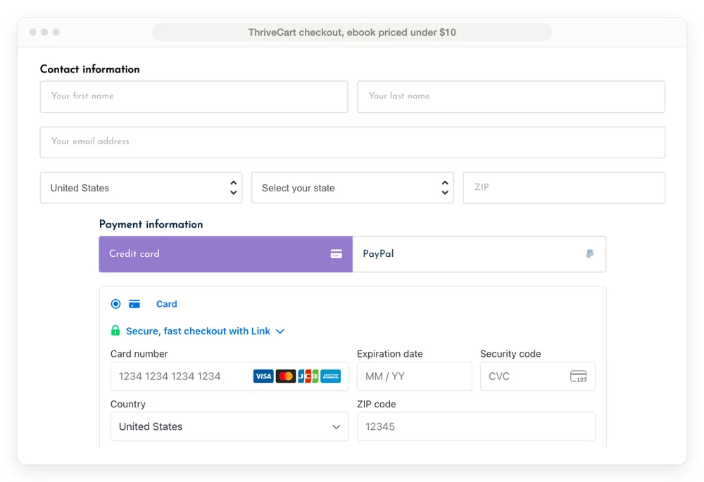
A live ThriveCart checkout for an ebook priced under $10. Read the country and ZIP boxes near the top, then find them again at the bottom.
That form asks for 11 boxes to sell a file priced under $10. Baymard Institute, which tests ecommerce checkouts, puts the average at 11.3 form fields and says most sites need only 8. Those are stores with a shipping address to collect.
The first pair of country and ZIP boxes sits in the seller’s own contact section, and the second sits inside Stripe’s payment box, which asks for them by itself. Much of this is the seller’s call. ThriveCart’s help docs list address options from country only up to a full address, and say country and ZIP are required if sales tax is on. The $20 ebook in the table shows the result: 6 boxes on the same tool.
Cut 2: drop what your checkout tool already does
Guest checkout is on all 7 lists, yet all 13 checkout tools in my comparison table already let a buyer pay without logging in. The same goes for 9 rules in total: guest checkout, coupons, card autofill, card error messages, SSL and PCI, security badges, the order summary, the pay button and saved details for repeat buyers.
All 13 tools also support coupons, though the box only showed on some checkouts. On 6 of the 8 checkouts the card boxes belong to Stripe, and Payhip’s card button comes from PayPal, so Stripe and PayPal handle autofill, error messages, SSL and PCI on those boxes. 5 of the 8 also show a lock icon inside Stripe’s box. The order summary, the pay button and saved details came built in on most of the checkouts I opened. That leaves 27.
In Baymard’s survey, once you set aside people who were only browsing, 19% of US shoppers who left a cart did not trust the site with their card. In my view, the Stripe or PayPal box handles that worry better than a logo you paste in. Convertcart’s review of real checkouts says generic badges are fine, but badges that answer a real objection do better. The objection a digital buyer has left is what if the file disappoints, and your refund line, further down, answers it.
Cut 3: drop the fixes built for long forms
5 rules exist to make a long form feel shorter: merging steps into 1 page, a progress bar, fields that stay hidden until needed, saved progress and a review step. They make sense on Baymard’s average checkout, which runs 5.1 steps. A digital sale is a much shorter trip. 7 of the 8 checkouts started as 1 page, with Payhip handing the card step to PayPal, so there’s nothing left to merge. A progress bar on a single page has nothing to show.
Sellfy is the exception, with email and payment on 2 screens. The guides split on that anyway: Chargebee and GoCardless want 1 page, while Pageflows says a linear flow with clearly defined steps typically performs best. Baymard’s research says the number of form fields matters more than the number of steps. At 6 or 7 boxes you can skip that argument. That leaves 22.
Cut 4: move these off the checkout page
Reviews are the clearest case of a good idea in the wrong place, and 7 more join them: FAQs, live chat, the one-time or subscription choice, exit pop-ups, abandoned-cart emails, loyalty rewards and new-customer onboarding. Reviews, FAQs and the choice of plan belong on your sales page, above the point where someone reaches for a card. The SamCart and ThriveCart pages in the table run the sales page and the form on 1 long page, so the buyer scrolls past that proof first.
If you send people straight to a checkout link from social media, keep 1 short review above the form.
Exit pop-ups split the guides again. Chargebee and Vendo recommend them, and GoCardless says to avoid pop-ups. A pop-up on a page you just cleared of distractions works against you.
Abandoned-cart emails do real work, but they happen after the buyer leaves. At BirdSend, my email company, 1,101 people had abandoned checkout as of June 2022, and 56 of them later became users. That’s a 5.09% recovery rate on a software signup, so your number may differ. It’s a job for your email tool, and here’s what cart abandonment software costs if you want it. Rewards and onboarding also come later. That leaves 14.
Cut 5: drop what needs big traffic or a high price
Big stores can afford 5 habits you can skip for now: A/B tests, AI price changes, local currencies, local languages and buy now, pay later. At a 3% conversion rate, spotting a 20% lift in an A/B test takes about 13,900 visitors per version, using the usual sample-size formula at 95% confidence and 80% power. That’s about 27,800 visitors in total, or roughly 9 months at 100 visitors a day.
Buy now, pay later earns its place on an expensive item. If you sell a $500 course, put this one back. On a $19 ebook, I would skip it. Add currencies and languages once your sales show real buyers from those countries. That leaves 9.
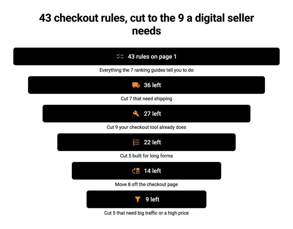
What is left: the 9 rules the best checkout page still follows
9 of the 43 rules survive: few boxes, a clean page, a phone check, payment choices, the full total, tax, a refund line, an order bump and the screen after payment. A good tool helps with most of them, but the boxes, the refund line and the after-payment screen need a person to check.
| Rule | Do this | Cost | Limit |
|---|---|---|---|
| Fewest boxes | Ask for email, card details, country and ZIP | A setting, if your tool offers it | A full name is your call |
| Clean page | Your logo, no menu, no links away | A setting | It can’t rescue a weak offer |
| Phone check | Open your checkout on your own phone | 5 minutes | 1 phone is not every phone |
| Payment choices | Card plus PayPal, and a wallet if offered | Processor fees | Some buyers still walk |
| Full total | Show the final price above the button | A setting | Tax can change the total |
| Tax | Charge by buyer location where the law says so | Your time, or a cut to a tool that files it | Rules differ by country |
| Refund line | 1 plain sentence near the button | Nothing | Won’t stop every refund |
| Order bump | 1 tick-box add-on | Built in on most checkout tools | Lifts order value, not buyer count |
| After-payment screen | Download button plus the same link by email | Built in on most checkout tools | Check it with a test purchase |
A checkout page template you can copy
The template below is my own illustration, built from those 9 rules. Use it as a list of settings, top to bottom.
[Your logo]                 (no menu, no footer links)

[Product name]              [Final price, tax shown if charged]

Email address
Card number    Expiry    Security code
Country        ZIP
Pay by: [Card]  [PayPal]  [Wallet, if offered]

[ ] Add the [$9 workbook] to this order   (order bump)

[Pay $29 button]

14-day refund. Email [[email protected]] and I'll sort it out.

After payment:
"Your file is ready" + [Download button]
"The same link is on its way to [buyer's email]"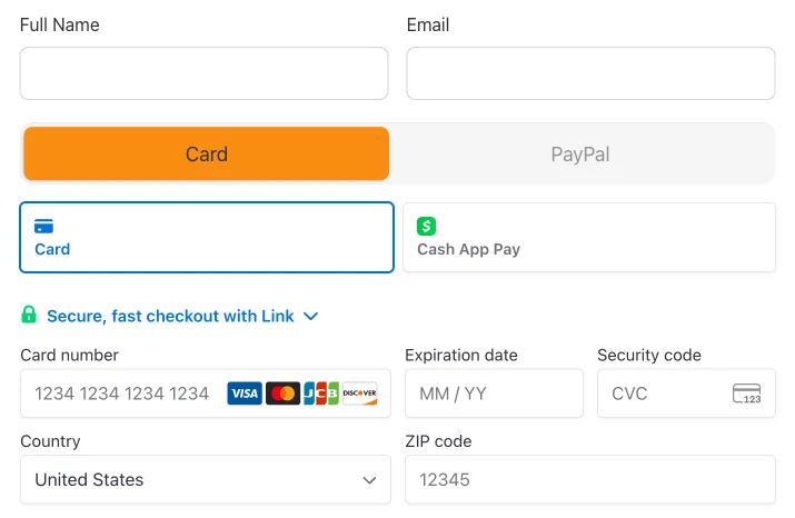
My own CartMango checkout: 7 boxes on 1 page. The full name box is the one you could argue with.
Checkout page design on a phone
On mobile, keep the boxes in 1 column, with the price visible and the pay button easy to reach. I measured each form from first box to pay button on a phone-sized screen. SamCart’s 13 boxes ran 1,372 pixels, about 1.6 screens. ThriveCart’s 11-box $19 ebook ran 759 and CartMango’s 7 ran 730, close to 1 screen each. Layout counts as much as box count, so open your own and scroll.
Payment choices and the name box
A poster in r/ecommerce checked big stores and found they “all had PayPal express checkouts” but not all had Apple Pay. Baymard’s survey puts too few payment methods at 9% of US shoppers who left a cart for a reason other than browsing. Card plus PayPal is a sensible floor. On boxes, start with the name. Baymard found that 89% of sites still use more than 1 name field, and that a single “Full Name” box caused far less trouble. Gumroad and CartMango both use 1, and a download can skip the name box if your tool lets you.
Tax, the rule most guides skip
Only Chargebee gives tax by location its own section, and a download can cross a border on its first sale. In the EU, VAT on an online sale to a consumer goes by where the customer lives. Under the EU VAT rules, the EUR 10,000 threshold only helps sellers based inside the EU. That is the reason country stays on the form.
The tool decides who deals with it. Gumroad acts as the legal seller and handles sales tax and VAT for you, as my Gumroad vs Stripe breakdown explains. On CartMango you stay the legal seller, so the tax stays with you too. If you sell abroad, read up on VAT for digital files.
The order bump: 1 tick box at checkout
An order bump is a tick box at checkout that adds a small extra to the order. Chargebee and Convertcart both recommend add-ons at checkout, while The Good warns that most checkouts are the wrong place to ask. On a low-priced file, I side with adding 1.
Bumps are on CartMango, Gumroad, Payhip, ThriveCart and SamCart, and Sellfy limits them to its Business and Premium plans. Here’s how an order bump works. Pick something that costs you nothing to deliver and fits the main file: a checklist, a template, a short video. 1 is enough, and an upsell page after payment is a separate job.
Do not cut the screen after payment: none of the 7 guides covers the download
After payment, a digital buyer needs 3 things right away:
- A download button on screen. Make it the biggest thing on the page.
- The same link by email. Say which address it went to, so a typo gets spotted fast.
- A person to contact. 1 email address, in plain sight.
A store that ships gets days to deliver. Your buyer expects the file right away.
Most guides stop at the receipt. Vendo gives the thank-you page 1 bullet, and Pageflows’ advice for the confirmation page is an estimated delivery date and a check of the delivery address. Baymard’s list of reasons people leave has slow delivery at 20%, which is about shipping. The digital version of that worry, in my view, is a link that never arrives. Return policies, at 13%, are about physical goods too, but a refund on a file is a fair match, which is why the refund line survived.
You can set this up before they pay too. The $19 ThriveCart ebook tells buyers beside the form that an email with a download link arrives right after checkout.
Check who controls the link as well. My comparison table marks ThriveCart as the 1 tool of 13 whose download links are not protected, so a shared link can keep working. The digital delivery systems guide compares your options, and this one covers protecting digital downloads. Then run a real test purchase, which shows you this screen the way a buyer sees it.
The refund line needs care here too. Buyers in the EU normally get 14 days to cancel, and on a download they lose that only after expressly agreeing to give it up by starting the download. If you sell there, get advice on your refund wording and tick box.
FAQ
How many fields should a checkout page have?
For a digital product and a US buyer, 6 is the shortest full card form I counted: email, card number, expiration date, security code, country and ZIP. Baymard says most ecommerce sites need only 8 form fields, and those stores have a shipping address to collect. Anything above 7 on a download is worth questioning.
What is the difference between a cart page and a checkout page?
A cart holds several items and shows a running total. A checkout page takes the payment. If you sell 1 product at a time, you can skip the cart and send buyers straight to checkout, which removes a step. This guide on adding a cart shows both routes.
Can I get a good checkout page for free?
Every free option has a cost. Gumroad has no monthly fee but takes 10% + $0.50 per sale, and Payhip’s free plan takes 5% per sale. CartMango is free right now, then from $10 a year once paid plans start in November, with 0% per sale. Card processing fees still apply on all 3.
Do I need to code a checkout page template?
No. Hosted checkout tools build the page for you, so you only choose the boxes, the price and the extras. Use the template above as a list of settings to check. Coding your own means taking on card security, delivery and tax yourself, which is a lot of work to sell a file.
A short checkout you do not have to build
The best checkout page for a digital product comes down to 6 or 7 boxes, a clear price and a download button after payment. Several tools in that first table can get you there once you switch off what you don’t need, and a test purchase will show you what’s left.
If you’d rather start with that already in place, CartMango’s checkout runs 7 boxes for a US buyer, takes 0% per sale, delivers the file on its own and includes order bumps on every plan. It’s free right now, and paid plans start in November from $10 a year.
About the Author

👋 I’m Welly, founder of CartMango (the site you’re on), a checkout platform for digital product sellers. We’ve previously processed $179M+. I also run BirdSend (email marketing tool, 3.1B+ emails sent). On the side I show other non-techie digital sellers how I use AI workflows to automate 50%+ of my operations. Find me on LinkedIn.
Related Reading
- Shopping cart software: the 3 kinds it comes in, and the delivery job most guides skip
- Online store for digital products: what 3 store types really cost on a $10 sale
- Cart abandonment software: what recovery costs, and the job your email tool still does
- WooCommerce checkout plugin: if your checkout lives on WordPress