

Knowing how to create a sales page comes down to 2 things: copy that walks one specific buyer from their problem to a decision, and a place to publish it. Tools like Carrd, systeme.io, or CartMango’s Mini Pages let you host a single page and link it straight to checkout, no website required.
You already know roughly what you want to say. The problem is usually getting it live.
Maybe you’ve rewritten the headline 3 times in a Google Doc, and it’s still sitting there. Turning it into an actual page seems to mean a website, a domain, a developer, or an afternoon fighting a page-builder plugin you’ve never touched. That gap between having the words and having a live page buyers can click “buy” on is what stalls most people, more often than weak copy does.
This post covers both halves: the structure that moves someone from curious to paying, and the fastest honest way to get a page live today, with or without a website of your own.
Key Takeaways
- A sales page has one job: get one specific reader to buy. Homepages and about pages do other jobs, and mixing them in weakens the pitch.
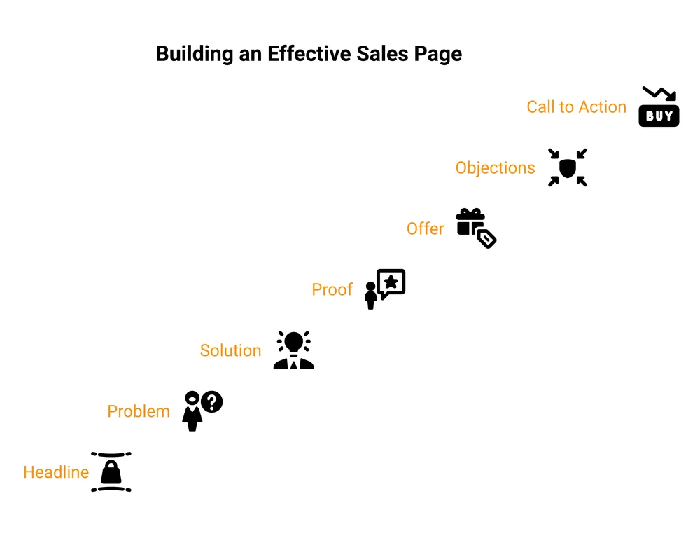
- Structure does more work than clever writing. Headline, problem, solution, proof, offer, objections, and one clear call to action, in that order, carries most pages.
- You don’t need your own website to publish one. Hosted single-page tools let you write, design, and link straight to checkout without touching code.
- A realistic conversion rate is single digits. The median landing page converts at 6.6% (Unbounce, Q4 2024). Double digits is already strong.
- Match length to price. Cheap, familiar offers sell on short pages. Expensive or unfamiliar ones need the long version.
What a Sales Page Actually Is (and How It’s Different From a Landing Page)
A sales page is a single page built to do one thing: convince a specific person to buy a specific thing, right now.
Landing page is the broader category. Any page built around one goal, signing up for a waitlist, downloading a lead magnet, registering for a webinar, counts as a landing page. A sales page is a landing page with a narrower job: close a sale, not collect an email.
The difference shows up in what each page asks of the reader. A newsletter landing page asks for an email address, which costs a reader a few seconds. A sales page asks someone to hand over money, so it has to do a lot more convincing before that ask even shows up.
Before you write a word of sales copy, it’s worth checking whether you’re about to repeat a mistake that undoes it. The free 5-day Online Selling Mistakes Challenge walks through the most common ones solo digital sellers make (pricing, positioning, and yes, sales pages) so you catch them before you publish.
Selling a $19 template pack? Your page can be short and direct, because the buyer isn’t risking much.
Selling a $500 course? Expect to need more proof, more objection-handling, and a longer page, because you’re asking someone to trust you with a bigger decision.
The Anatomy of a Page That Actually Sells
Every sales page that converts follows roughly the same pattern, in this order:
- Headline. Say what you’re selling and who it’s for, in one line. If someone only reads this, they should know whether to keep going.
- The problem. Name the specific frustration your buyer already has, in words they’d use themselves. Prove you understand them before you try to sell them anything.
- The solution. Introduce what you’re selling as the answer to the problem you just named. Outcome first, features second.
- Proof. Testimonials, results, screenshots, before-and-afters. Anything that lets someone other than you vouch for the offer.
- The offer. What exactly do they get, and what does it cost? Be specific. Vague pricing reads as something to hide.
- Objections. Answer the 3 or 4 reasons someone talks themselves out of buying, before they get the chance to.
- Call to action. Tell them exactly what to click and what happens next. Repeat it more than once on a longer page.
Skip a block and a hesitant buyer stalls right there instead of buying. Drop the proof, and price-sensitive buyers won’t trust the offer. Drop the objections, and buyers close the tab still holding the exact question that would have converted them.
A sales page template you can fill in
If a blank page is the blocker, start from this skeleton and replace the brackets:
[PRODUCT NAME]
The [what it is] that helps [who it's for] get [the outcome]
without [the thing they dread].

THE PROBLEM
You're trying to [goal]. Right now that means [painful current process].
Most people end up [bad outcome].

THE SOLUTION
[Product] is [one-sentence description]. It works by [mechanism].

WHAT YOU GET
- [Deliverable 1] so you can [benefit]
- [Deliverable 2] so you can [benefit]
- [Deliverable 3] so you can [benefit]

PROOF
"[Testimonial with a specific result]" ([Name, who they are])

THE OFFER
[Price]. [What happens immediately after purchase.]
[Guarantee, if you offer one.]

QUESTIONS
[Objection 1]? [Answer.]
[Objection 2]? [Answer.]

[BUTTON: action verb + outcome, e.g. "Get the templates"]
That’s the full structure on one screen. Work it against an offer you’ve already shaped, or use it to pressure-test one you’re still building.
Writing the Copy: One Reader, One Offer
Before you write a single headline, decide who exactly you’re writing to. Not “creators” or “small business owners.” One person, with one problem, buying one outcome.
Most beginner sales pages fail on targeting before they fail on writing. A page written for photographers, coaches, and course creators all at once convinces none of them, because nobody feels like it was written for them at all.
Two things fix this fast:
Message match. Whatever someone clicked to arrive at your page (an ad, a post, a link in your bio) should be echoed in your first line. If your Instagram post promised “how to price your first digital product” and the page underneath opens with something else entirely, you’ve broken trust before the pitch even starts.
Benefits before features. A feature is what the thing includes. A benefit is what happens in the buyer’s life because of it.
“40 Lightroom presets” is a feature. “Edit a full wedding gallery in under an hour” is a benefit. Lead with the second one, then back it up with the first.
How to Create a Sales Page Without a Website
This is the part most sales-page guides skip. They’ll tell you what to write, then wave at “your landing page builder” like everyone already has a website. Most solo sellers don’t, and building a site to sell digital products from just to hold one page is overkill.
(Already have a site and only need checkout on it? Adding a shopping cart to an existing website is the more direct path.)
You have a few real options, and they’re not equal:
| Tool | Cost | Code needed | Checkout built in | Best for |
|---|---|---|---|---|
| Carrd | Free (3 sites), paid from $9/year | None | No, needs the $19/year tier to embed Stripe, PayPal, or Gumroad | Simple one-pagers, portfolios |
| Leadpages | From $10/month | None | No, connects to a separate processor | Publishing pages fast, optimizing later |
| systeme.io | Free plan, paid from $17/month | None | Yes, its own checkout | Sellers who also want funnels + email in one tool |
| Mini Pages (CartMango) | Free during beta, then from $10/year | None | Yes, links straight to CartMango checkout | Digital sellers who want the page and checkout in one place |
Prices verified 2026-07-19 from each tool’s own pricing page.
Notice the split in the checkout column. A tool that hosts your copy but doesn’t handle checkout means a second tool, and a second thing that can break between “click buy” and “get paid.” Carrd and Leadpages are good at what they do, they’re just built to solve the page half only.
That leaves systeme.io and Mini Pages as the 2 that close the loop from page to payment in one system. They’re aimed at different people.
systeme.io bundles funnels, email, and courses at $17/month ($204/year), which makes sense if you want that whole stack. CartMango’s Mini Pages is narrower, just the sales page and the checkout, at $10/year after the beta.
I run CartMango, so treat that as disclosure rather than a neutral recommendation. Pick whichever one fits what you’re actually selling.
To be clear about what none of these tools solve: none of them bring you an audience. Whichever one you pick, every visitor to that page is still one you have to bring yourself, through an email list, social posts, or ads.
A hosted sales page removes the “I don’t have a website” excuse. The “nobody’s found my page yet” problem is still yours.
In an r/indiehackers thread where a solo founder asked why 3 straight launches went nowhere, one commenter laid out the minimal version that had worked for them: validate on Reddit or with a Google Form first, then build the page. Carrd plus a Google Form got them past 100 signups for a language-learning community, and a few of those turned into paying signups. Small numbers, but real ones, and the page itself was nothing fancy.
If you’re weighing checkout platforms more broadly rather than just where the page lives, the Gumroad alternatives breakdown covers that side of the decision.
What Conversion Rate to Expect (and How Long the Page Should Be)
A useful gut check before you obsess over every word: what’s actually a good conversion rate?
Unbounce analyzed 41,000 landing pages, 464 million visits, and 57 million conversions in Q4 2024. The median conversion rate across every industry was 6.6%. A rate of 10% or higher is generally considered strong.
So even a well-built sales page selling to a decent audience will have roughly 9 or more visitors out of 10 leave without buying. Normal, not a sign your page failed. It’s a stronger argument for driving the right traffic (people who already want what you’re selling) than for endlessly rewriting your headline.
On length: match it to how much convincing the price needs. A $15 template doesn’t need a life story and 6 testimonials, just a clear headline, 1 or 2 proof points, and a straightforward CTA.
A $500+ course or service package usually needs the full structure, with more objection-handling and more space to build trust before someone hands over that much money.
If you’d rather fill in a structure than stare at a blank page, the landing page copywriting template walks through prompts for each section above.
Sales Page Examples: The Same Skeleton, Filled In
The template above is easier to judge once you see it with real words in it. Here is the same 7 blocks written out for a made-up product, a $39 Lightroom preset pack for wedding photographers. The product is invented for illustration, the structure is not.
MIDNIGHT PRESETS
The Lightroom pack that gets wedding photographers
out of the editing cave and into bed before 1am.

THE PROBLEM
You shot a 12-hour wedding on Saturday. It is Wednesday
and you are still editing it. The couple has emailed twice.
You are matching skin tones frame by frame at midnight,
and every gallery takes a week you do not have.

THE SOLUTION
Midnight Presets is 40 presets built for indoor and
golden-hour wedding light. You apply one, nudge exposure,
and the whole gallery holds a consistent look.

WHAT YOU GET
- 40 presets (.xmp) so you can edit on desktop or mobile
- A skin-tone panel so faces stop going orange under tungsten
- A 6-minute setup video so you can install without guessing

PROOF
"I cut a 40-hour gallery down to about 9. First time I have
delivered in under a week." (Priya R., wedding photographer)

THE OFFER
$39, one payment. Download link lands in your inbox
straight after checkout. 30-day refund, no questions.

QUESTIONS
Do these work in Lightroom Mobile? Yes, desktop and mobile.
What if my style is darker? Every preset is a starting point,
and the pack includes 3 moodier variants.

[BUTTON: Get Midnight Presets]
Two things to notice. The headline names the buyer and the outcome, not the file count. And the proof sits right next to the price, where the hesitation actually happens, instead of being stacked at the bottom.
Across the pages I have built and reviewed, the same handful of choices separate the ones that sell. This is a founder’s read, not a controlled study:
- The headline names the buyer, not just the product. “The preset pack for wedding photographers who edit at midnight” beats “40 Lightroom presets.”
- Proof sits close to the price, not just at the bottom. A testimonial next to the buy button does more work than 5 stacked at the very end.
- The FAQ handles real objections. “What if I’m not good at Lightroom yet?” beats “What format do I receive this in?”
- One call to action, repeated. Pages offering a free trial, a newsletter signup, and a purchase button in the same breath convert worse than pages asking for 1 thing.
Rather than copying a specific brand’s page word for word, look at which of these structural choices your own page is missing.
Mistakes That Kill Conversions
| Mistake | Why it happens | Fix |
|---|---|---|
| Selling features, not outcomes | Easier to list what’s included than think through why it matters | Rewrite each feature as “so you can ___” |
| No single clear CTA | Trying not to be pushy, or offering too many next steps | Pick 1 action, repeat it 2-3 times down the page |
| Vague or hidden pricing | Fear the number will scare people off | State it plainly. Buyers who go hunting for the price lose trust faster than buyers who saw it upfront |
| Skipping objections | Feels negative to raise reasons not to buy | Answer the top 3 objections before the reader has to ask |
| Writing for everyone | Wanting to reach as many people as possible | Narrow to one buyer. A page speaking to one person outsells one speaking vaguely to everyone |
FAQ
How do you structure a sales page?
Most sales pages that convert follow the same order: a headline naming the offer, the problem the buyer already has, your solution, proof it works, the offer and price, answers to common objections, and a clear call to action. Leaving one out gives a hesitant buyer somewhere to stall.
How can I create a sales page?
Write the copy first, using the structure above, then publish it. You don’t need your own website. Tools like Carrd, systeme.io, or CartMango’s Mini Pages let you build a single hosted page and link it straight to checkout without touching code.
What is the 70/30 rule in sales?
It comes from sales training, where the guidance is that the buyer should be talking about 70% of the time and the seller 30%. Applied to a page, it’s a rough check that most of your copy is about the reader’s problem and outcome rather than about you. Treat it as a gut check, not a ratio to measure to the word.
What is a sales page?
A sales page is a single web page built to convince one specific type of buyer to purchase one specific thing. It’s a narrower version of a landing page, which can be built around any single goal, not just a sale.
Do I need a template to write one?
No, but it speeds things up. The fill-in skeleton earlier in this post covers every block a page needs. Most people find that learning how to create a sales page gets easier once the structure is already on the screen and they’re just replacing brackets, rather than writing into a blank document.
Once you know how to create a sales page, the page itself is the easy half. Write the 7 blocks, put them somewhere buyers can reach, and connect the button to a checkout that actually takes money. If you want the page and the checkout in the same place, that’s what CartMango is built for, and it’s free while we’re in beta.
About the Author

👋 I’m Welly, founder of CartMango (the site you’re on), a checkout platform for digital product sellers. We’ve previously processed $179M+. I also run BirdSend (email marketing tool, 3.1B+ emails sent). On the side I show other non-techie digital sellers how I use AI workflows to automate 50%+ of my operations. Find me on LinkedIn.
Related Reading
- How to sell digital products without a website: the wider set of options when you have no site at all
- How to add a shopping cart to a website: for when you already have a site and just need checkout on it
- Landing page copywriting template: section-by-section prompts for the copy itself
- Offer creation: work out the offer before you write the page that sells it
- Best Gumroad alternatives: for readers ready to compare checkout platforms